Design
Because my graphic design clients vary so much, I’m simply listing projects chronologically, rather than categorizing them by type.Kansas Local Food Summit
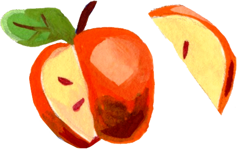
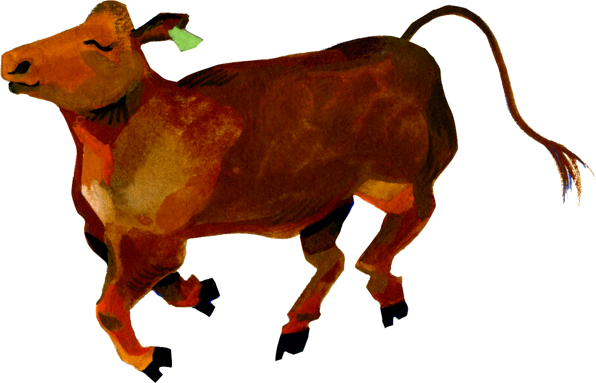
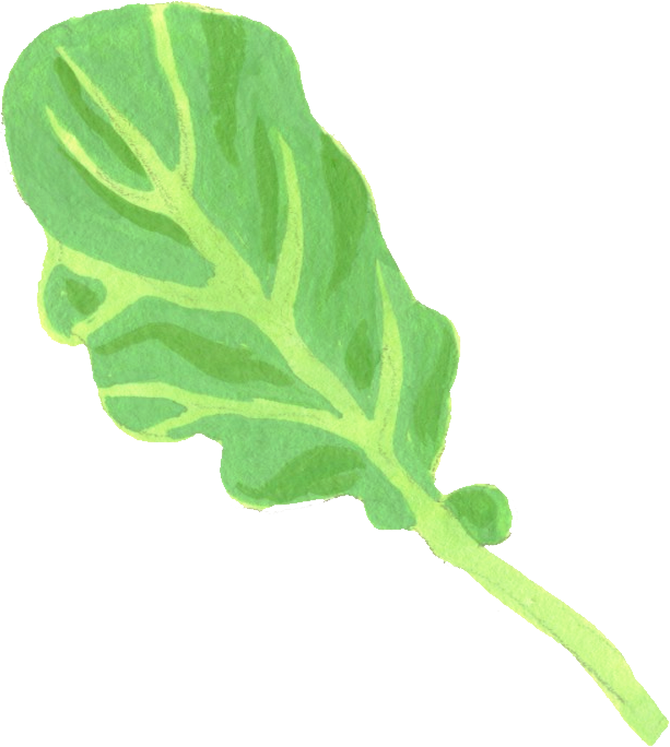
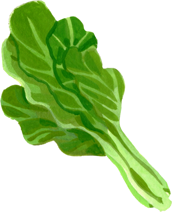
I designed Kansas State University’s logo and brand for their annual local food systems gathering. The client, naturally, wanted to represent the best of Kansas agriculture in the logo, and saught a fun theme to match the subheading “Painting A Vibrant Future”. I made a number of illustrations based on actual crops produced Kansas, most of which ended up in the final logo-- whose shape is a subtle outline of the state, as well as a blue background to represent one of Kansas’s best natural features, its big beautiful views of the sky.


logo assets
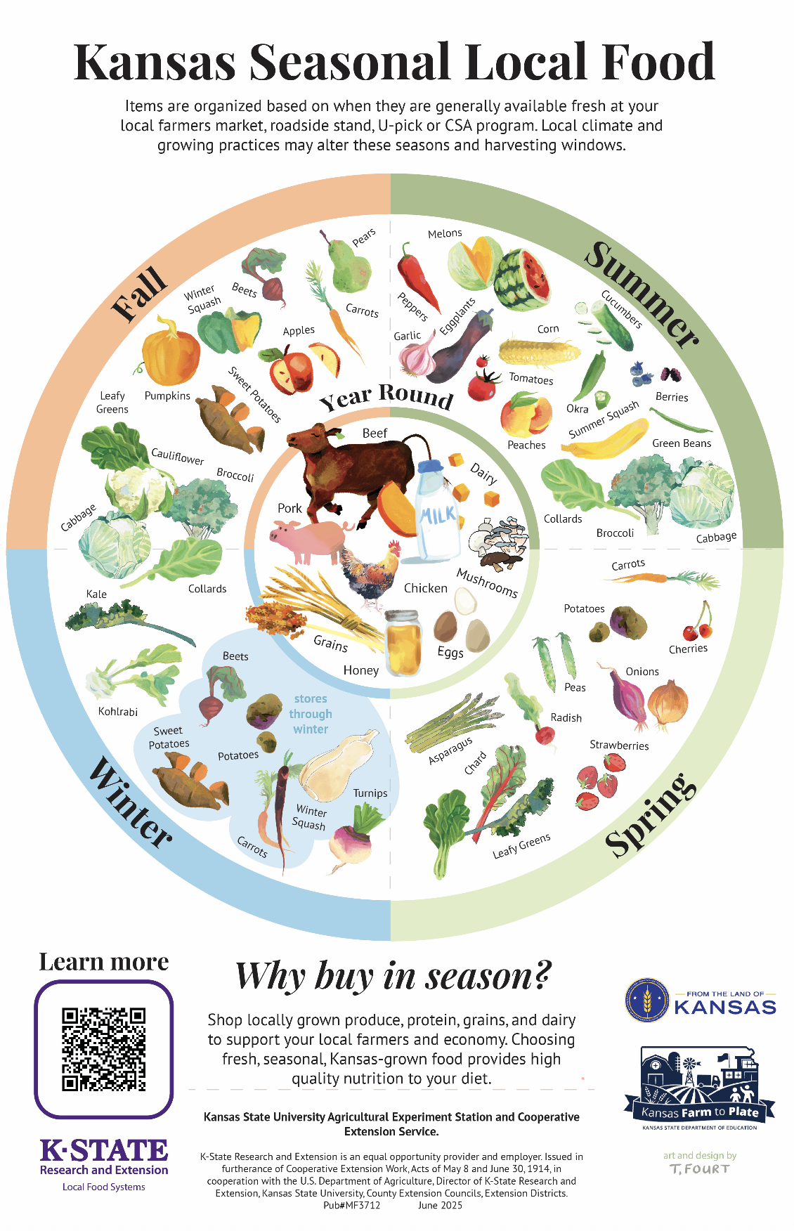
The client also commissioned me to create a Seasonality Calendar to represent various foods grown in Kansas that can be bought througout the year. This was developed into an interactive seasonal food wheel, as well as a poster in both English and Spanish.
Kansas City Growing Growers logo
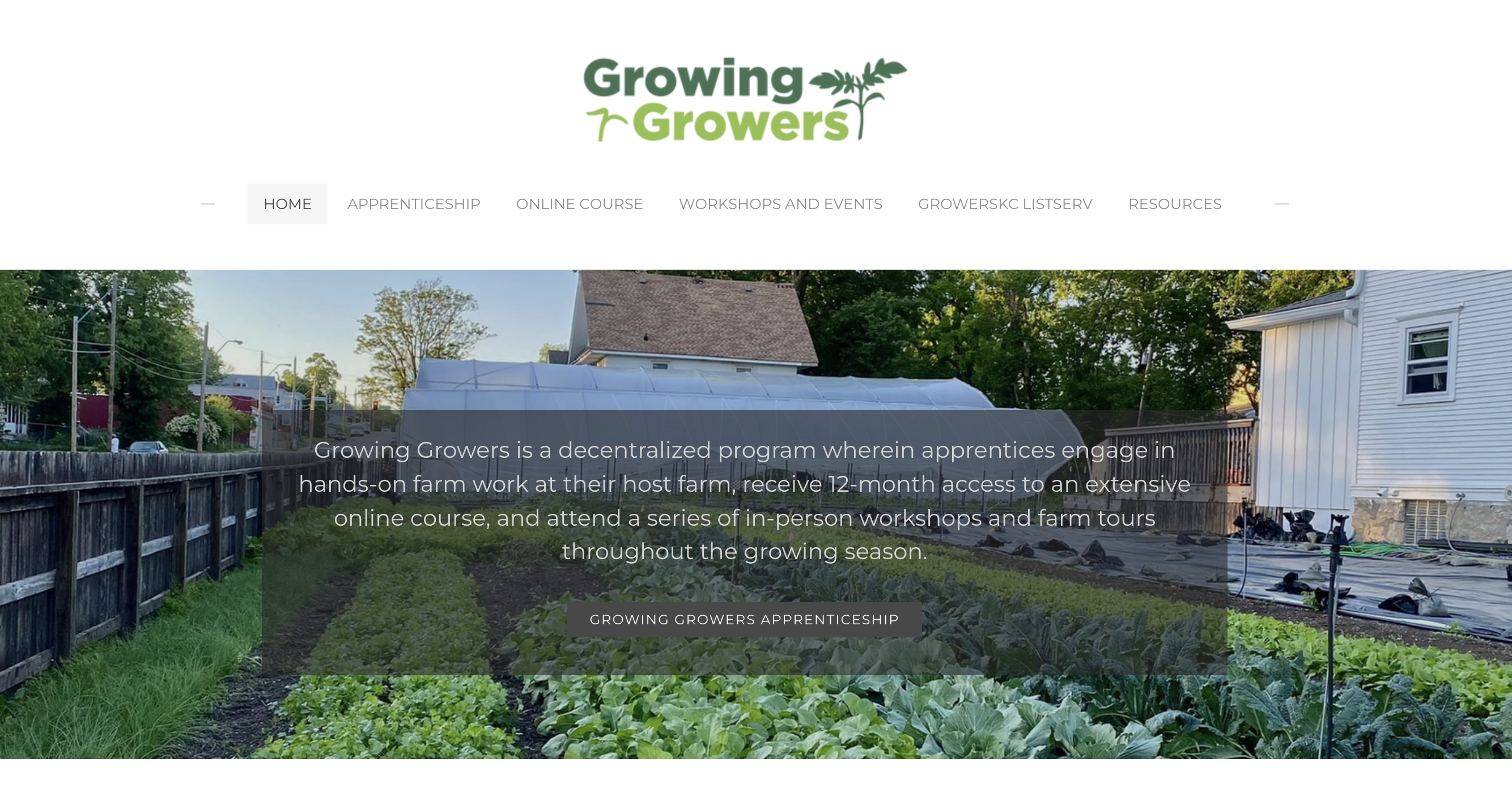
Growing Growers, KC is an apprenticeship program which provides hands-on experience combined with reading, classes, and training that will give you the basics you need to get started farming. Many farms in KC started with this impactful program, and I’m honored to have designed their first real logo.
Client wanted a simple representation of what an apprenticeship does: grow! Since so many growers in kansas city specialize in vegetables, I gave them choices between three crops with very identifyable silhouettes-- squash, peppers, and tomatoes. The client chose tomatoes because of their popularity in farmers markets.
Client wanted a simple representation of what an apprenticeship does: grow! Since so many growers in kansas city specialize in vegetables, I gave them choices between three crops with very identifyable silhouettes-- squash, peppers, and tomatoes. The client chose tomatoes because of their popularity in farmers markets.
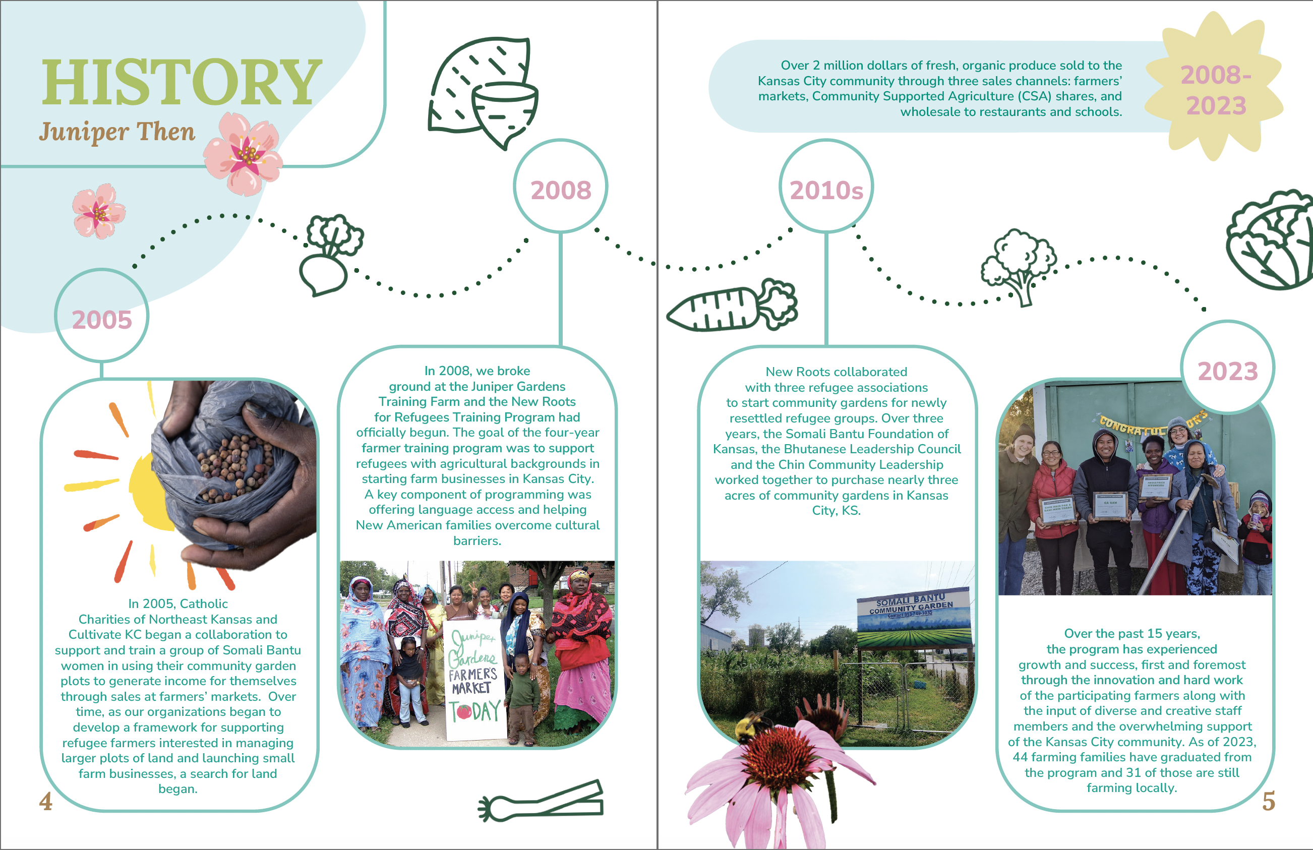
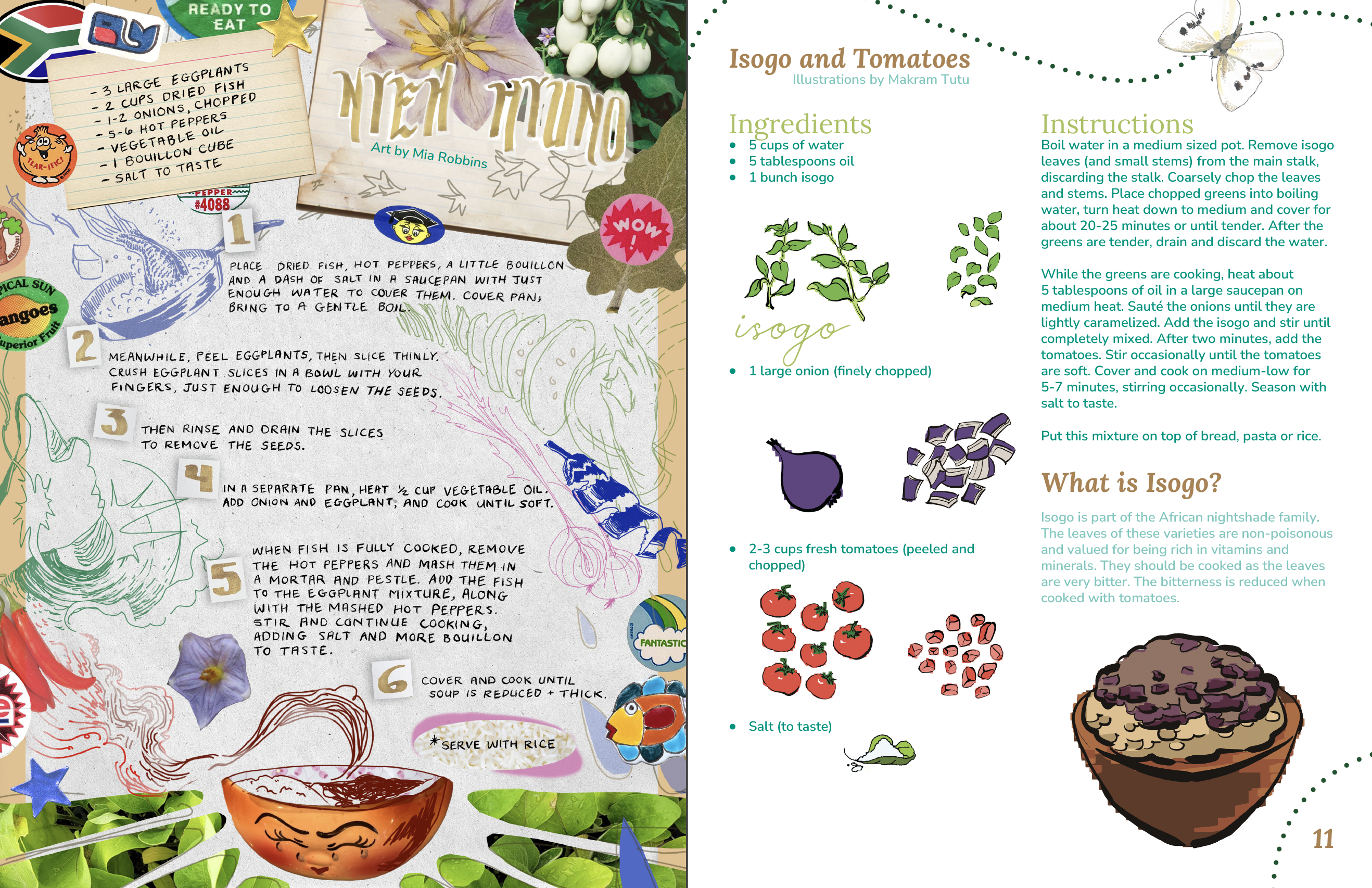
New Roots’ 15 year anniversary booklet
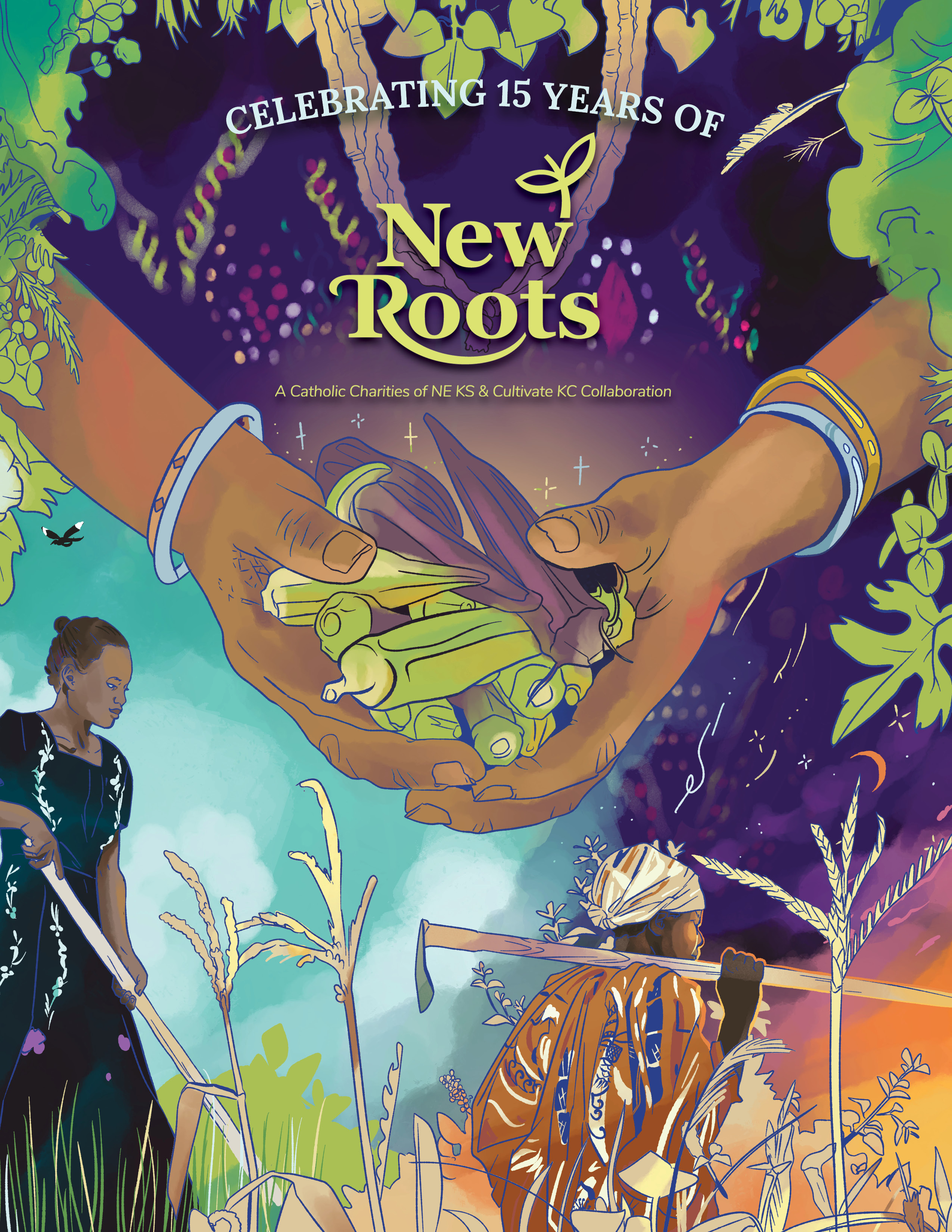
cover image
New Roots Kansas City wanted to commemorate fifteen years of successful operations with a 24 page, full color book, packed with testimonials, history and delicious recipes. Using staff photography, custom made illustrations, and with some team effort by way of Studio Cheeks, I was able to direct this project to finish.
![]()
![]()
![]()
![]()
![]()
![]()
![]()


Kansas Foodwork
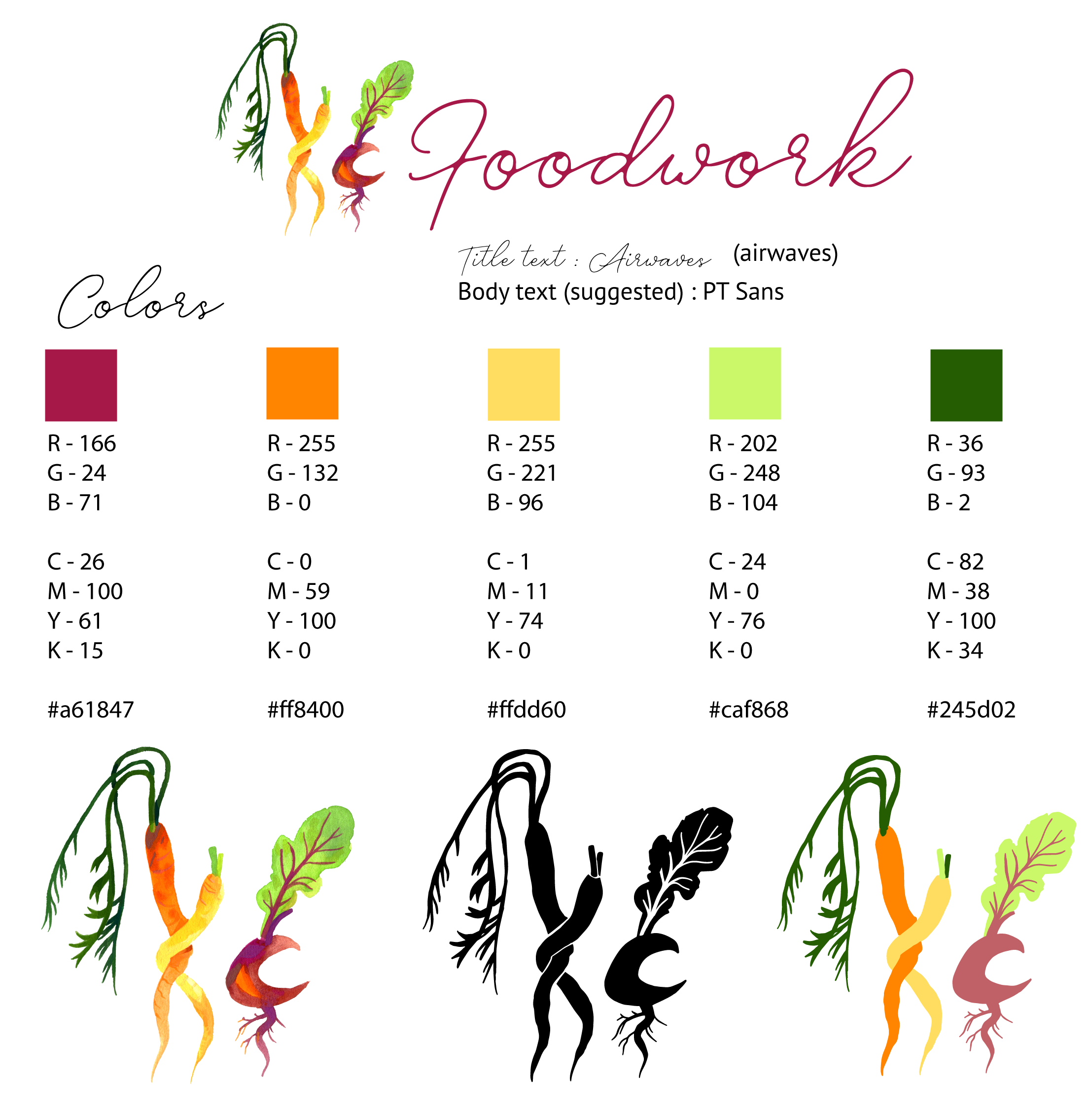
This client specifically sought me out for my watercolor illustrations of vegetables, and wanted me to create her new non-profit’s logo. She specifically had the image of the intertwining carrots in mind for the K, and selected the beety C from various other options. This was a simple, easy, and fun logo project.